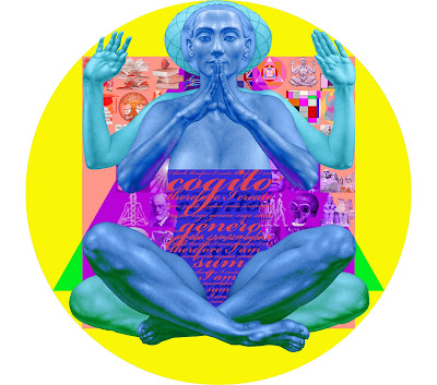
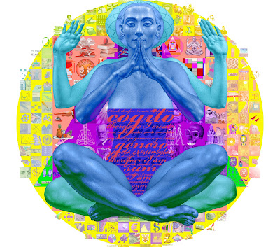
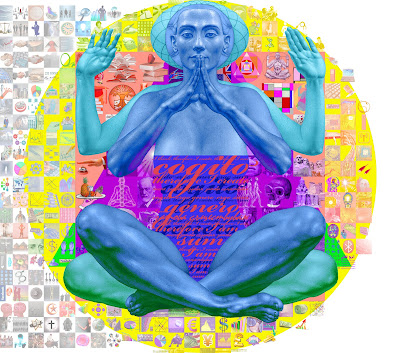
The color scheme/color composition for arranging the images inside the center is based on the direction of color wheel from orange, red, violet, blue and green in clockwise direction. The outer images are following the anti-colorwise direction of the color wheel.
The following design versions show the sequence of visualization of the images filled in the square outside the human form:
The following versions show the images filled within the triangle and circle outside the square:
The last four versions illustrate the images inserted to the outside background space of the circle:


Congratulations!It is looking good even godly!We have assosiation for a mozaic , chess ,pop art.It is a very successful formula between the format and the idea.
ReplyDeleteAfter Professor Oleg presented the final idea of the mural my first initial thought was, "wow, that is a lot of work." I understand now when Professor Oleg explained in previous classes that murals take much work, time, and dedication. I have been working on my mural portion for so many hours. I respect and honor Professor Oleg's dedication and work ethic. The mural is absolutely wonderful with such a symbolic meaning. It is truly a masterpiece. The tiny images are difficult to paint in some cases, but it has been a pleasure of mine to actually contribute to something so beautiful.
ReplyDeleteСтани, благодаря за отзива. Много ми хареса асоциацията ти, че фоновата част на проекта напомня шах. Това само донякъде е така и затова ще споделя истинската ми идея – исках фонът да е своеобразна „кръстословица”, по-скоро – „кръстообразница”, която всеки зрител да разреши сам за себе си по посока – кои образи кои науки символизират/изобразяват?
ReplyDeleteРазбира се, има много подсказвания, които подпомагат решаването на образния ребус като това, че отделните науки са разположени САМО в точно определени сегменти, получени от пресичането на геометричните фигури – триъгълник, квадрат и кръг. Много от 396-те фонови образи „разказват” истории, вицове и шеги; изграждат дълги или къси асоциативни вериги или пък образни структури и ритми с ясни послания; или директно илюстрират някои науки. В същото време за сметка на тези „бонуси” има и объркващи моменти – като еднаквостта на цветовете между много от сегментите, промяна на основни асоциативни значения (например светът на компютрите е прието да е в синьо-сивия спектър, а в този стенопис е ...розов) и преливането на четири доста сходни науки в двете бели части на фона и др.
Във всички случаи в този стенопис има много за гледане и разбиране. Макар и малък по размер той е с изключително сложно и полифонично образно звучене.
Stani, thank you for your comment. I quite like your association of the background with a chessboard. Indeed, it is accurate, but only to a certain extent – I will share with you my original idea – I aimed to turn the background into a kind of “crossword puzzle”, or rather, a “cross-image puzzle”, which every viewer is to do for himself with regard to which images symbolize/depict which disciplines.
ReplyDeleteCertainly, there are many hints, which help to solve the sort of puzzle, such as that the individual disciplines are situated ONLY in specific segments, formed by the crossing of geometric figures – triangle, square, and circle. Many of the 396 background images “tell” stories and jokes; they link up into long or short associative chains or image structures and rhythms with clear messages; or they directly illustrate some of the disciplines. At the same time, these “bonuses” are balanced by some confusing aspects – for example, the identical colors in many of the segments, the transformation of major associative meanings (for instance, the computer world is routinely seen in the blue-and-gray spectrum of color, and in this mural it is… pink) and the gradation of four rather similar disciplines in the two white parts of the background, etc.
In any case, this mural offers much to be seen and understood. Although small in size, it has an exceptionally complex and polyphonic image language.
Profesor Gochev congratulations!The mural painting is very very good,actualy is unbelivable i like it very much.I think the idea to have an image on two side is very good.Congratulations again!
ReplyDelete